
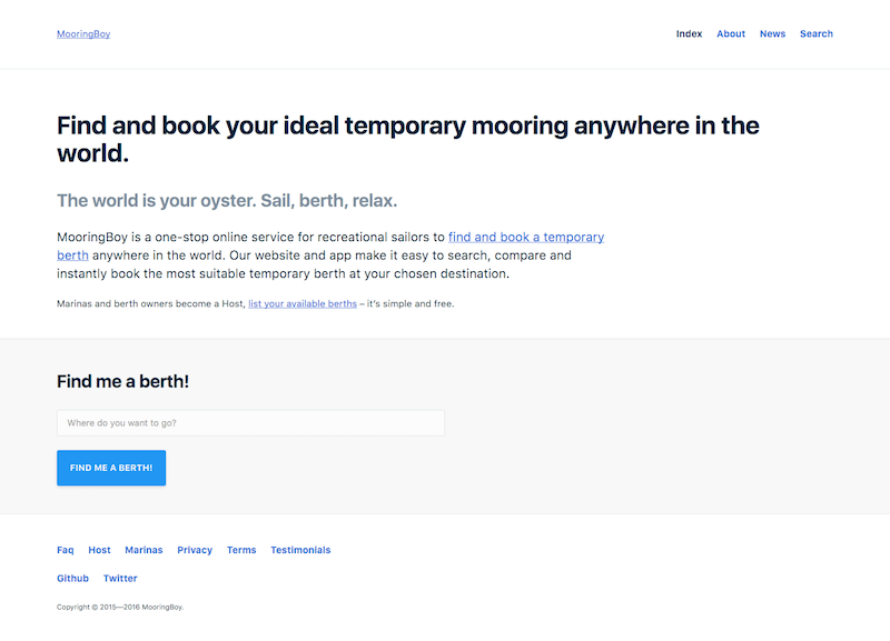
Conceived as a one-stop online service to help recreational sailors find, compare and book temporary berths anywhere in the world MooringBoy is, essentially, like AirBnB for boats!
Mooringboy also allowed marinas and berth owners to maximise their rental revenue by easily listing and managing their available berths. So, their website also needed to be able to explain what was on offer, in a clear and friendly way, selling the benefits of the service succinctly, and encourage consumer uptake across their target markets.
With complete creative control, and a remit to focus on UX Design, I was able to implement a robust, ground-up, design process to deliver a solution that could align precisely with the business goals.
Getting the basics right
Popular wireframing tools like Balsamiq and Axure seem like a great idea, but experience has taught me that the fastest and most efficient way of mapping out a design is still with pen and paper. Rough and ready sketches are a great way to quickly determine the most important elements of a design.
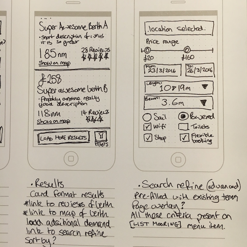
Focussing first on the mobile views forced me to consider what is, and what isn’t, important. Every design will require a mobile view, and it’s typically the hardest one to design for, so for me it’s the logical place to start.
Important things must go at the top, less important things go below that. It’s that simple.
Once we’ve covered the basics, the fundamental must-haves of a design, on small screens then growing that design out with the reduced constraints of larger screens is a much simpler proposition. This is why I believe that designing mobile-first is always the smartest way to go.
From sketches to code and copy
In the next stage of my design process I jumped straight into code. Recreating my scrappy sketches in HTML and CSS allows me to begin linking the various views together with a clickable, responsive, wireframe and to map out the information architecture for the site; deciding how elements link together and the pathways by which a user can get from A to B. This project used one of my favourite tools, the static site generator Jekyll to rapidly create all the rquired views and then rapidly iterate through this stage of the design process.
Focussing on content and information architecture
It’s at this point that it begins to become clear how copy, and other content, might be used in our design. Including draft copy in design at the earliest point possible also means we can consider it in context.
- Are we being to verbose?
- Could the language and intent be simpler?
- How does this link to that?
Pushing a design to code at the earliest point possible allows us to create a a ‘live’, that is easy to share with the client and can be viewed on any device. Of course, the devices the client actually uses is always a great start point!
- What will it look like on a tablet?
- How does a user create an account?
All these questions must be easily answered at this stage, and until they are there isn’t much point in taking the design any further.
to be continued…